An identity is a system, not a logo
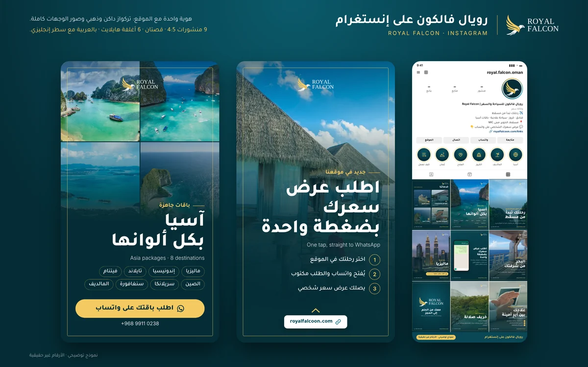
Many business owners order a logo and assume they now have an identity. The logo is the signature; the identity is what makes every post, document and page look like it comes from the same business before anyone even sees the logo: a consistent colour, a consistent typeface, a consistent way of arranging image and text. Ask for a system and a guide, not just a logo file.
Design for the small screen first
Most of the time your brand appears on a phone: a small round profile picture, a browser tab icon, a post scrolled past in a second. A logo that relies on fine detail or thin strokes disappears at those sizes. Test every concept at the smallest size it will appear before you approve it.
Arabic lettering deserves care
If your business name is Arabic, the way it's drawn is often what sets you apart most. Arabic lettering in a logo must read clearly and balance with the English version if there is one, without stretching or breaking letters apart in ways that hurt legibility. For body text, choose an Arabic typeface that reads comfortably on screen and is properly licensed.
What to prepare before you start
Your business name in Arabic and English exactly as it will be written, a short note on what you offer and to whom, competitors you don't want to resemble, and examples of brands you like and why. If you have an old logo, bring its best version. These answers cut revision rounds and bring the first concepts closer to what you want.
The files you should receive
Make sure you get the logo in a vector format such as SVG, PDF or AI that scales without distortion, PNG versions with transparent backgrounds, exact colour values and the names of the typefaces. Without vector files, you'll be back at the designer's door for every shop sign or large print.